
Periodically, in a narrow waterway with land on each side, the position of our boat as shown on our chart plotters appears as if we were on land. Sometimes, it appears ashore by several hundred feet. All cruisers have been “assured” that modern GPS technology and the Wide Area Augmentation System (WAAS) can place the boat within a few feet of it’s true position on the surface of the earth. Well, as in many things in life, I’ll give a qualified “yes,” and a definite “maybe…”
The easiest and most optimistic explanation for the boat appearing ashore is that the chart (or map) drawing does not show the land feature (waterway or roadway) in its true, correct location; i.e., there can be surveying and chart layout errors in the chart or road map drawings. Over time, however, one expects those kinds of errors would be discovered and corrected.
There can also be equipment-unique anomalies in individual manufacturers GPS and plotter equipment. For example, there is a power plant on the Oswego Canal that drove my Garmin GPS/chart plotter nuts, but did not affect my Raymarine GPS/chart plotter. Conundrum of the day: which unit operated “correctly?” Was the Garmin “wrong?” Should the Raymarine have been “affected?” We don’t know.
There is another much more complex, likely and difficult to compensate and correct explanation. Charts are flat pieces of paper which represent of a section of a spherical physical object; the earth.
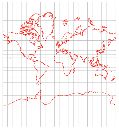
Mercator projection of the earth
Mercator projections are taken from the point-of-view on an imaginary cylinder aligned parallel to the earth’s axis. Since the imaginary cylinder is in contact with the earth’s surface at the equator, at that level, there is very little positional error between what appears on the earth’s surface and on the surface of the projected cylinder. But as the projection point-of-view moves north or south from the equator, the altitude of the cylinder surface gets farther and farther above the surface of the earth at the observation point, and more and more latitudinal position distortion is introduced. The figure at the left shows a Mercator projection of the earth. The horizontal and vertical grey lines show the latitudinal distortion that the Mercator methodology creates. Longitudinal distortion changes very little, but latitudinal distortion changes very significantly. To see that, compare the height of the block containing S. Florida with the height of the block containing the NYS Canal System. Significantly greater positional distortion is present.
There are several projection techniques that chart-makers use to minimize the kinds of positional distortion reflected above. All of these techniques are used in an attempt to accurately represent the spherical surface of the earth on a flat piece of paper. Conceptual portrayals of three common charting techniques are shown below.
Standard Mercator: Transverse Mercator: Polyconic:


Each of these techniques solves problems with positional distortion and introduces other problems with positional distortion, so the use of these techniques varies, and each brings pros and cons with them.

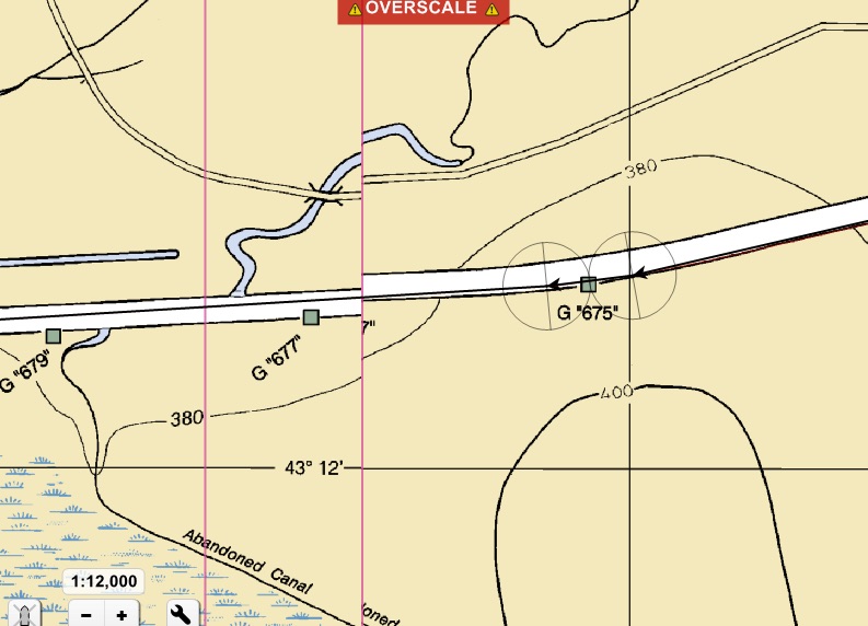
Electronic anomaly shows boat’s track over land, typical example, this one happens to be in the Oswego Canal, New York State Canal System.
Positional distortion with standard Mercator projection, as we have seen above, is minimal at the earth’s equator, but becomes a significant problem by +/- 40º of latitude. Forty degrees North latitude encompasses large areas of the US, the boundary regions of the US and Canadian Great Lakes, and large areas of Canada. In analyzing the NOAA and CHS charts I have in my eChart portfolio, I observe that along the Erie Canal, along the St. Lawrence Seaway, and in many places along the Canadian Canals Systems, two adjoining charts can be and often are done in different projections. Commonly, Mercator Projection charts are adjacent to Polyconic Projection charts. Each of these charts have different positional distortion characteristics. Where adjoining chart edges meet, chart features will not align perfectly.
“Quilting” distortion at the joint between two different charts, typical, this one on the Mohawk River, Erie Canal, New York
As a young Scoutmaster in the late 1960s and early 1970s, I often lead our troop on “overland, through-the-woods” map ‘n compass hikes, and 50-mile canoe trips, in the Adirondack Mountains of North-Central New York State. To show the traveling party where we would be going, and to show parents where we had been, I assembled a large overview of the geography of the trip from several separate, individual topographic maps of the region. The experience was a great learning opportunity for our Scouts, because if one aligns adjacent features at the top of adjoining edges of topo maps, features at the bottom edge of the maps will simply not align. Asking Scouts to explain “why” set off the most wonderful and eye opening analytical insights in their young minds! So, a compromise is always necessary in aligning adjacent charts, and user understanding of the phenomena is essential.
The inevitable conclusion is, the same issues with correct feature alignment occur with adjacent eCharts along “adjoining chart edges.” The “quilting” function of modern chart plotters and eCharting software is analogous to the hiker who tries to align the adjoining edge of paper topo maps on a table top. In one area, they align fine, but positional distortion makes it impossible for them to correctly align at all points along adjoining edges. They are, after all, flat pieces of paper representing the spherical surface of the earth.
eChart files are electronic representations of the contents on the projection of a local area at whatever chart scale is involved. Conceptually, the chart plotter firmware or computer software places objects on the chart plotter screen by calculating the position of the object from its “x” and “y” offset from the chart file’s index location. The latitude and longitude data coming from the GPS sensor is also calculated as an “x” and “y” offset from the index location. The index location is usually one “corner,” mathematically “0,0” of the chart’s boundary. Because of positional distortion, there will be some small positional errors with each chart/map. The farther the chart location is – in space – from the chart boundary’s index location, the more error is introduced. With chart plotters and computer software that support “quilting,” – the automatic overlaying and alignment of adjacent charts at adjacent chart boundaries – small visual discontinuities may actually be visible where land objects appear slightly offset from one another at the quilt boundary. We see this phenomena with different charts on our two chart plotters on the Erie Canal.
Depending on where a boat is on the chart grid, there may be proportionally more error on the “x”-axis than on the “y”-axis. Chart quilting also confuses that, because at different scales, there may be differing proportional error quantities associated with different scale charts.
Check out “Mercator projection” here: https://en.wikipedia.org/wiki/Mercator_projection and here: http://mathworld.wolfram.com/MercatorProjection.html. As you will see, the small element geometry is quite complex. The conclusion is, object misplacement may be caused either in creating the chart or in interpreting and presenting chart objects. But small element placement errors are definitely possible.
So, our boat appears ashore. What do we do? Simple safety and USCG Navigation Rules require that we all maintain an effective visual watch; we all simply must look out the windows. We must resist the temptation to rely solely on our electronic devices; gadgets, gizmos, and gilhickies. Just look out the windows.
The farther north we get (46 degrees in the North Channel), the more small position anomalies are likely to occur. On the Canadian Shield, there are rocks, not mud, to greet the boat that strays askance. TREAT CHARTS AS A GUIDE. THEY ARE ONLY A GUIDE. THEY ARE A GOOD GUIDE, BUT NOT A PERFECT GUIDE. When piloting a boat, look out the windows. On the US East Coast, DO NOT assume the ICW “magenta line” is accurate. In Canada, DO NOT assume that the “recommended sailing line” is accurate. DO NOT use a buoy in the water as a waypoint, as we may just get lucky and hit it. And in the above discussion, if we try to pilot the boat to its position on a chart plotter, we may indeed wind up aground. Always, always, look out the windows. What you see out the windows always takes precedence over what the chart plotter says, unless you have specific knowledge from a reliable source – like a Marine Safety Information Bulletin (MSIB) or Local Notice to Mariners (LNM) – that a given marker is off-station.
